Our New Logo
"Warrnambool's best-kept secret."
It's a phrase we've heard said with real affection over the years, and yet, it's not a title we want for our school anymore. Our new logo has been designed to change this.
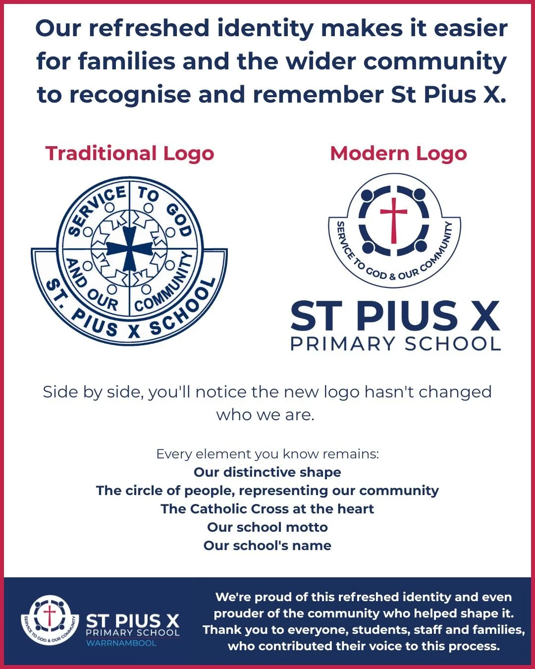
Whilst we love our traditional logo, our school's name has often gotten lost in it. More times than we can count, we've heard, "Oh, I didn't even know about St Pius X." Our new logo puts our name front and centre, so it proudly says who we are.
It’s a refresh - not a rebrand.
FAQ & More
-
Warrnambool's best-kept secret." We've heard it said with affection for years, but it's not a title we want anymore.
Whilst we love our traditional logo, our school's name often gets lost in it. We regularly hear, "Oh, I didn't even know about St Pius X." Our new logo puts our name front and centre, so it very proudly says who we are.
More students and families deserve to experience the high-quality, well-rounded education on offer here — and we're ready to make sure they know we exist. Our refreshed logo is part of stepping confidently into that next chapter, one where St Pius X is known for exactly what it is, a school where quality teaching, wellbeing and community come together.
For our current families, this matters too. Every time our name is seen with pride around Warrnambool, it reflects the community your children are already part of — one that's ready to stand a little taller and be a little louder about what makes it special.
So as you see the new logo appear, on our website and socials, in your inbox, eventually around the school, we'd love for you to be part of telling that story. Talk about St Pius X, tag us when you're proud of what your kids are doing here, and help us make sure the secret really is out.
-
We engaged Melissa Crothers, a designer with extensive experience working with Catholic schools on visual identity.
Her understanding of Catholic school culture gave us confidence we'd land on something true to who we are. From the outset, our Guiding Coalition was clear: we wanted a refresh of our existing logo, not a reinvention, which is why you'll still see strong influences of the old in the new.
The process was genuinely consultative. Across multiple design iterations, feedback was sought from:
Our Student Representative Council, who shared what resonated and what didn't, and we really listened
Our staff, across teaching and support teams
Our School Advisory Council, the eight parent representatives who speak for our families, their feedback was overwhelmingly positive
A lot of thought, conversation, and refinement has gone into this logo. For a deeper look at the symbolism and meaning behind each element, read our new logo elements explanation page.
-
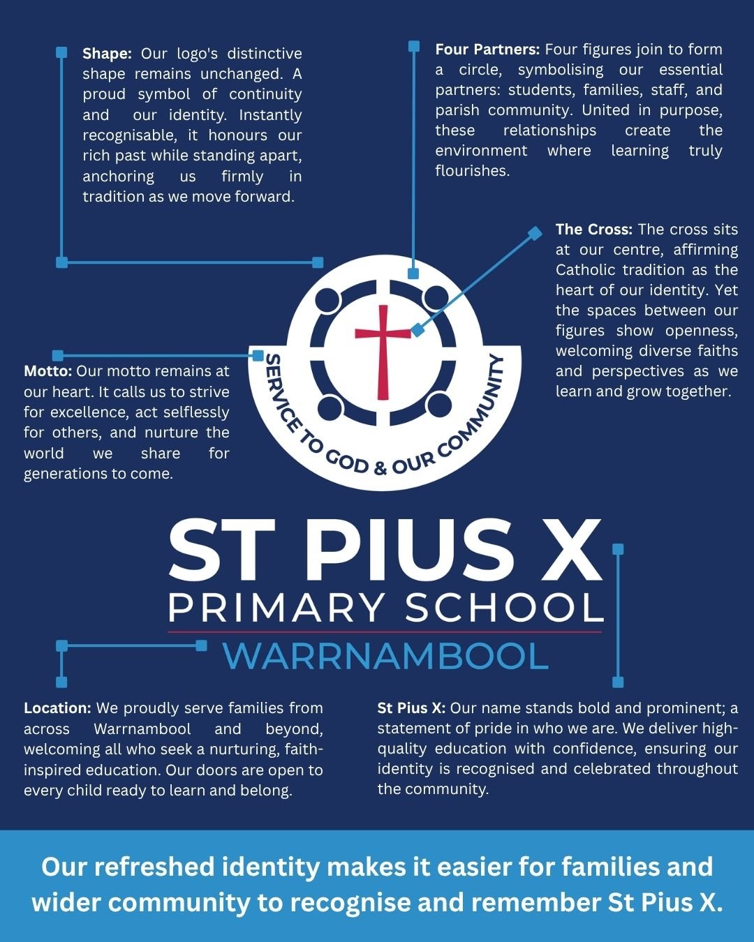
Four elements anchor our new logo, each chosen deliberately:
Our distinctive shape remains. As one of our students rightly pointed out, the silhouette of our logo is genuinely unique among school logos — it's recognisably ours, and we weren't about to lose that.
A circle of four figures. Each represents one of the pillars of our school community: our students, our families, our staff, and our wider community. The circle reflects how each supports the others.
A Catholic Cross at the heart. Faith sits at the centre of who we are and everything we do, and therefore it sits at the centre of our logo.
Our school motto remains. The words that have guided generations of St Pius X students continue to frame our identity.
-
We deeply appreciate the heritage and tradition of our traditional logo, it has represented St Pius X for many years and will forever be part of our story. You'll still see it remain in strategic locations around the school for some time to come, including on the glass of our front doors, where it honours the chapter it served so well and will remain permanently.
-
We're introducing the new logo in three stages, so the transition is smooth and considered rather than an overnight overhaul.
1. Digital — starting immediately. The new logo is rolling out straight away across our email signatures, website, newsletter, and social media.
2. Printed — coming next. With our address also recently changing, new stationery was needed regardless, so this gives us a natural opportunity to update our printed materials with the new logo at the same time.
3. Physical — a gradual transition over the next 2–3 years. Signage around the school will be progressively replaced as part of this longer-term stage.
-
There's no urgency for families to update their uniform. Existing uniform remains completely fine to wear, staff also wear the traditional logo, and will happily keep doing so, so students have that modelled for them too.
Here's what to expect going forward:
Remaining stock of uniform with our traditional logo is limited, and will be sold at a discounted price while available.
New orders will feature the new logo. Once they arrive, availability will be communicated through the newsletter.
2027 Year 6 jumpers will be the first to carry the new logo — a fitting way for our next cohort of student leaders to mark the change.
We know some families have raised the idea of reviewing our uniform more broadly. That's a bigger piece of work, and one we'll look at properly in the next few years, separate from this logo transition.